Selected work · 2025 – 2026
Back2School
Type
Child-sponsorship platform
Duration
9 months
Year
2025 – 2026
Role
Frontend Developer
Outcome
One profile component shared across three surfaces
Tools
- Angular
- TypeScript
- Tailwind CSS
- Supabase
- Chart.js
- Azure
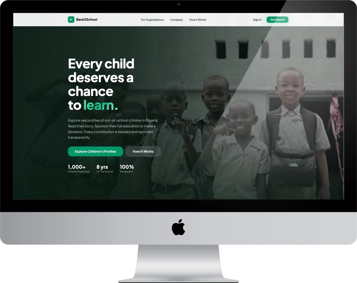
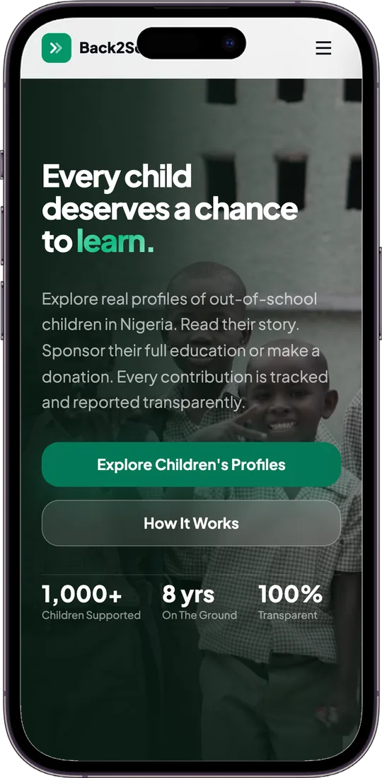
A child-sponsorship platform carrying real profiles of out-of-school children in Nigeria. You read a child's story, then sponsor their full education or make a one-off donation, and every contribution is tracked and reported back. Three surfaces: the public landing page, a sponsor dashboard, and an admin dashboard for the team on the ground.
Back2School carries real profiles of out-of-school children in Nigeria. You read a child's story, then either sponsor their whole education or make a one-off donation, and every contribution is tracked and reported back rather than disappearing into a general fund. The site claims over a thousand children supported and eight years on the ground.
Three surfaces in Angular: the public site where the profiles are browsed, a sponsor dashboard, and an admin dashboard for the team doing the work. Supabase holds the data, Chart.js draws the reporting, and it runs on Azure. Nine months, which a platform handling other people's donations deserves.
Inside Back2School
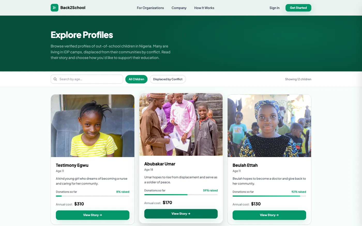
The page the whole platform rests on
Back2School carries real profiles of out-of-school children in Nigeria, and this is where a visitor meets them. Each card gives a photograph, an age, one line of the child's own story, and the amount raised against what a year actually costs, with filters above for the situations the organisation works across. Nothing else on the site matters if this page does not work: a donor who cannot find a child does not become a sponsor. The funding bar is on the card rather than one click deeper for the same reason, since knowing a child is at 20% is often what decides it.
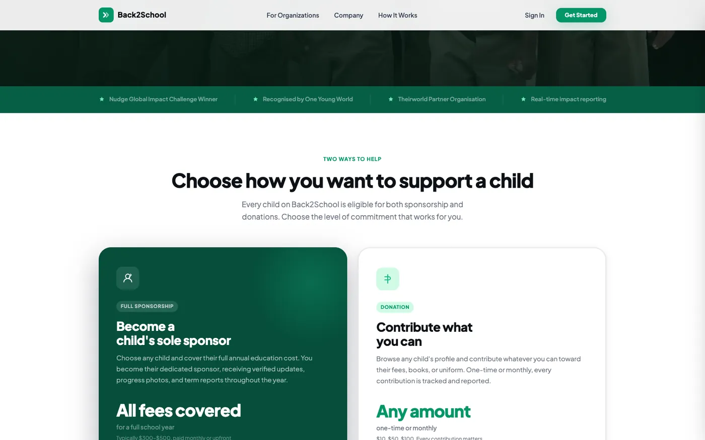
Two ways to give, weighted equally
Full sponsorship against a one-off contribution, side by side and given the same visual weight. Sole sponsorship covers a child's annual cost and comes with verified updates, progress photos and term reports. The other is any amount, once or monthly. Charities usually push the larger commitment and treat the smaller one as a fallback, which makes the smaller giver feel like a lesser one. Presenting them as a genuine choice is a fundraising decision as much as a design one.
The empty state, because that is the first screen
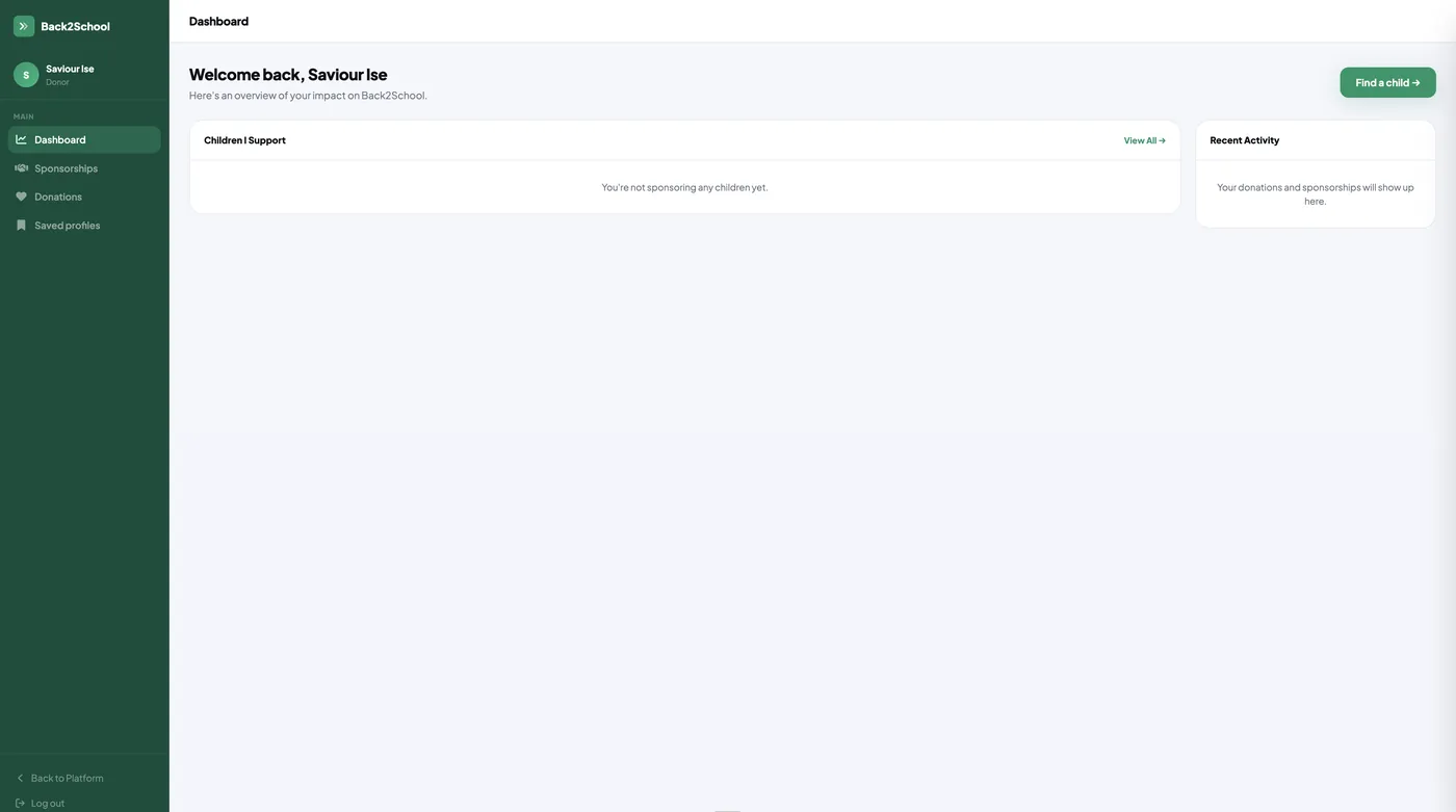
Shown exactly as a new donor sees it. This is the screen most people meet first and the one most often left undesigned, so both panels say plainly what will appear in them, and the single call to action is Find a child. An empty dashboard that explains itself keeps someone moving; one that just says No data sends them away.
Totals in place before there are any
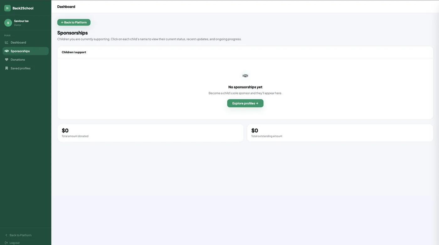
The same discipline a level down: no sponsorships yet, one clear route out of that state, and the two figures a donor will eventually care about, total donated and total outstanding, already laid out at zero rather than hidden until they have a value. Outstanding matters here in a way it does not on most products, because a sponsorship is a commitment across a school year rather than a single payment.
Designed around how the decision is really made
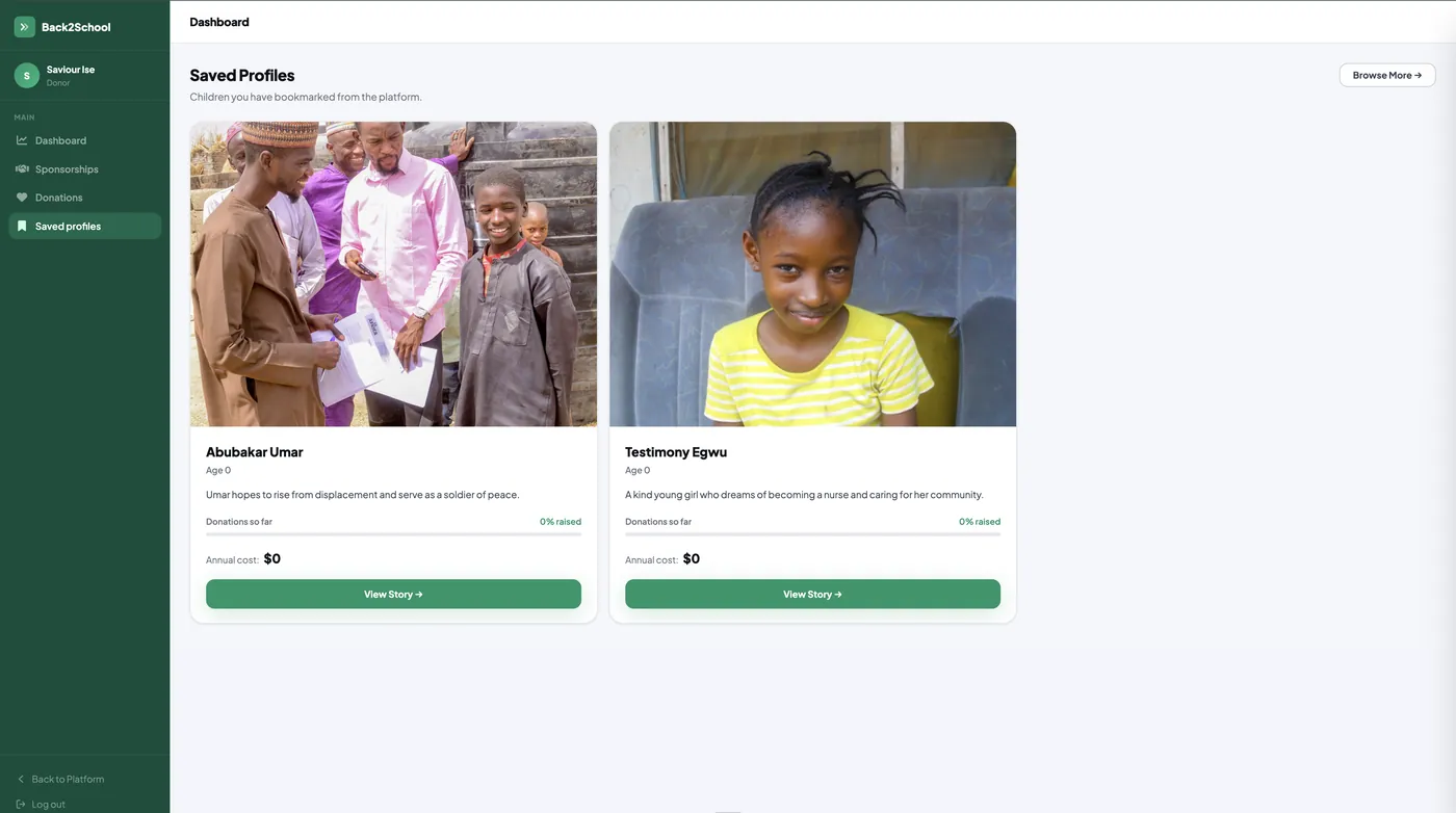
Sponsoring a child is not an impulse purchase. People shortlist, think, talk to someone, and come back days later, so bookmarking is a first-class feature rather than an afterthought. Each saved card keeps the funding progress and annual cost visible, so the choice can be made from the list without reopening every story. Three surfaces share this data, the public site, the sponsor dashboard and the admin panel, and the child profile is one component across all three so a profile cannot say different things in different places.